UNF's out of state viewbook
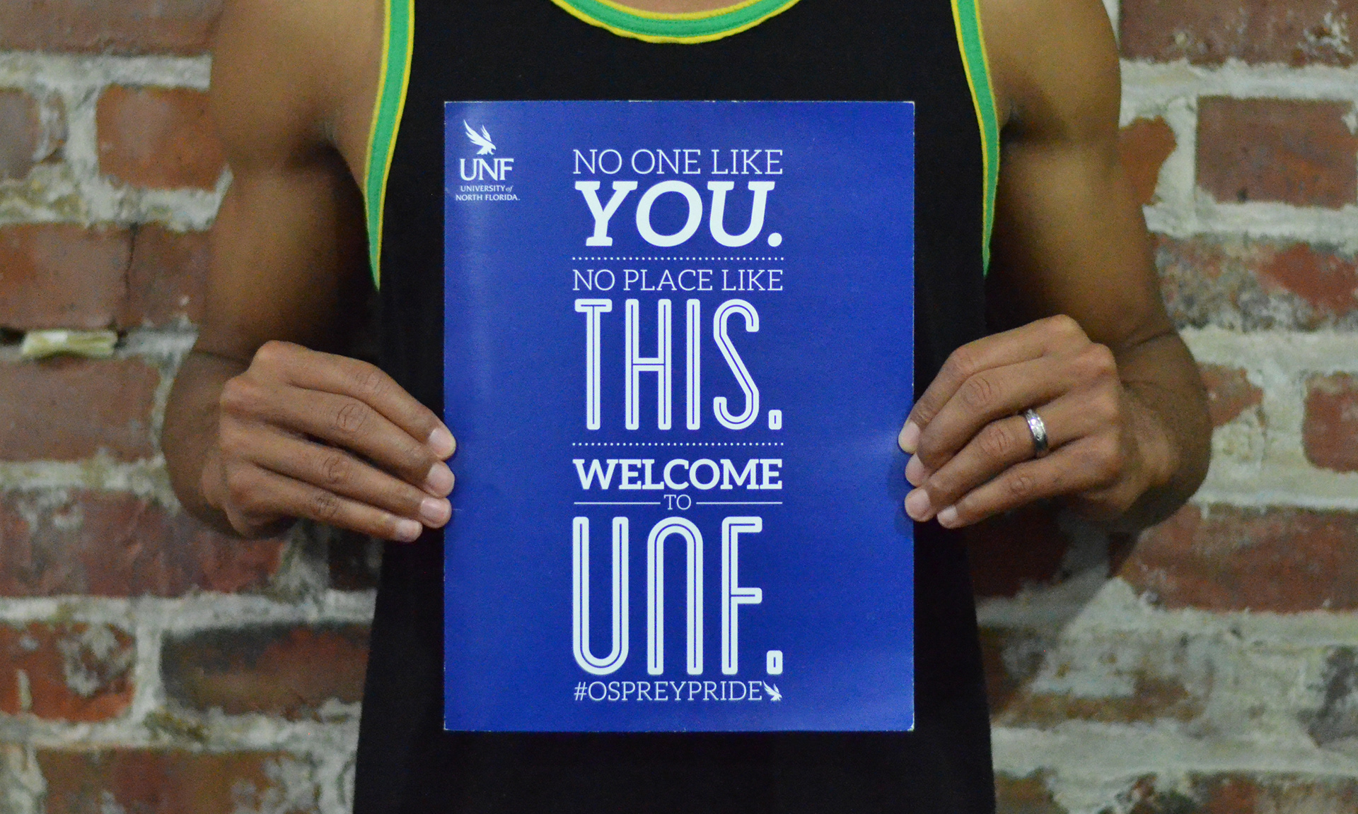
Outside view of the Admissions tour folder
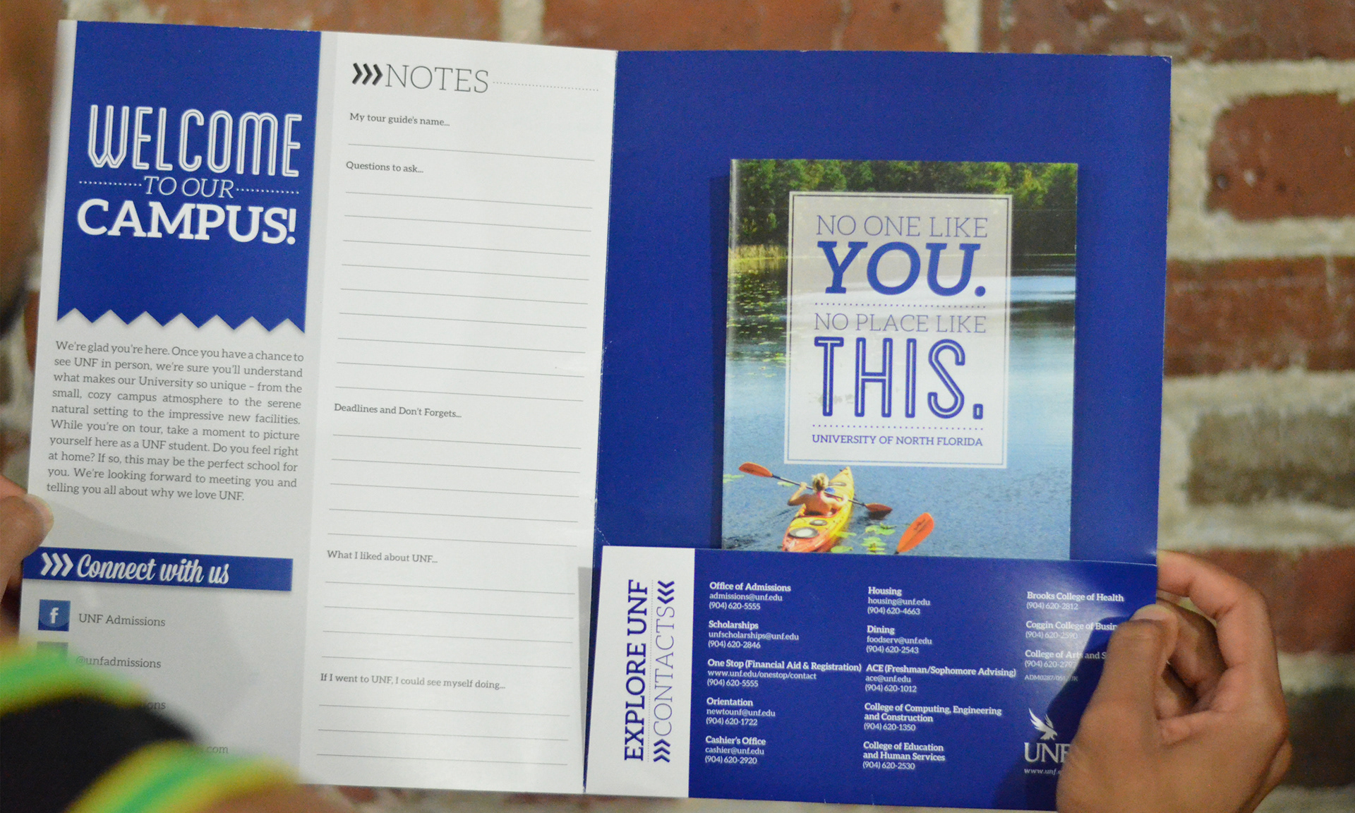
Inside view of the Admissions tour folder with the Out-of-State Viewbook inside

Out-of-State Viewbook Cover
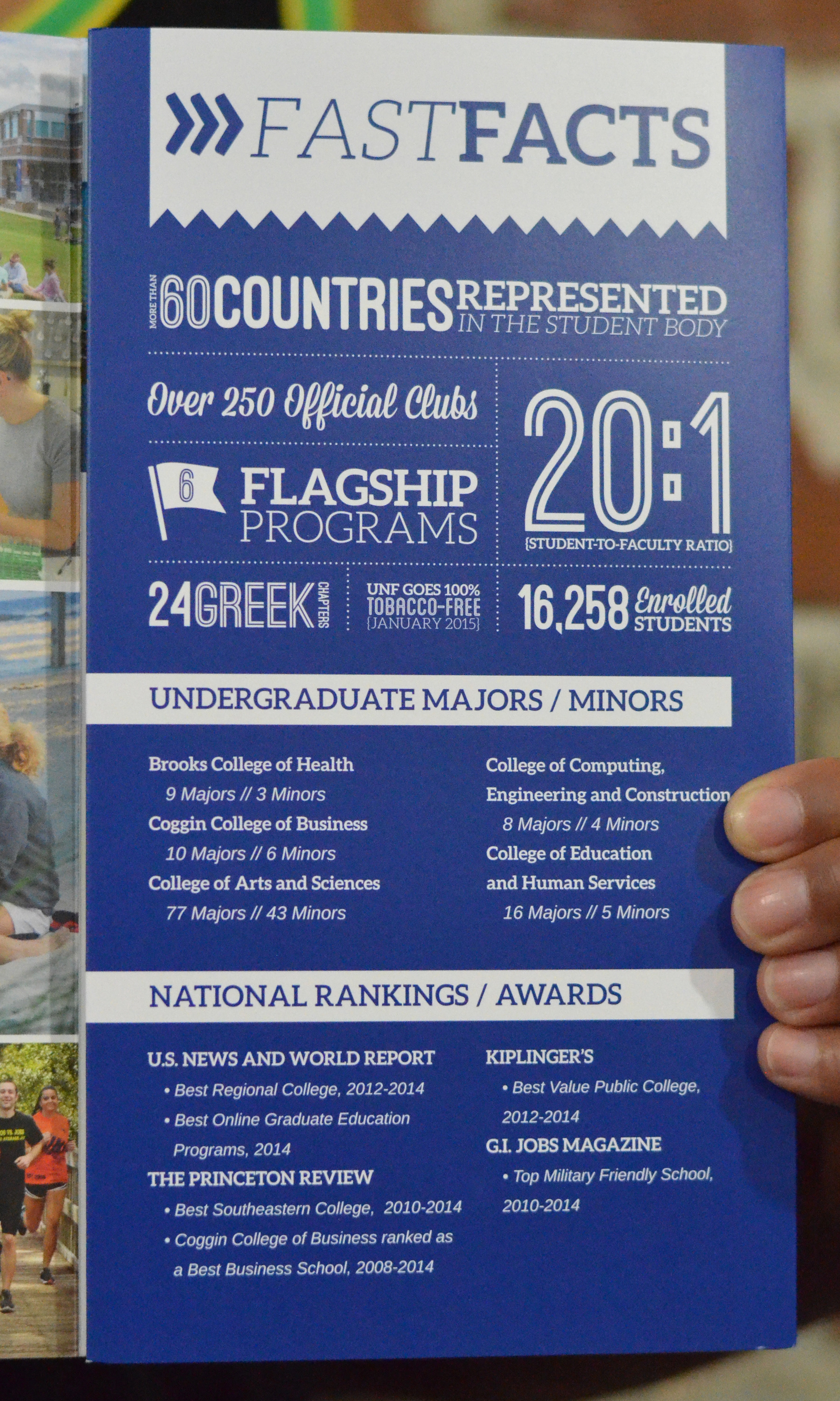
Out-of-State Viewbook panel details
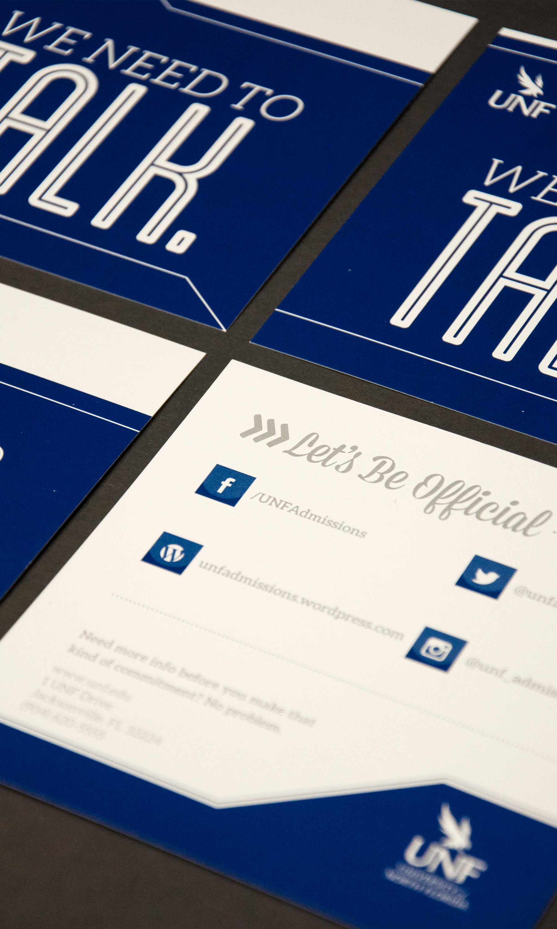
Social media card
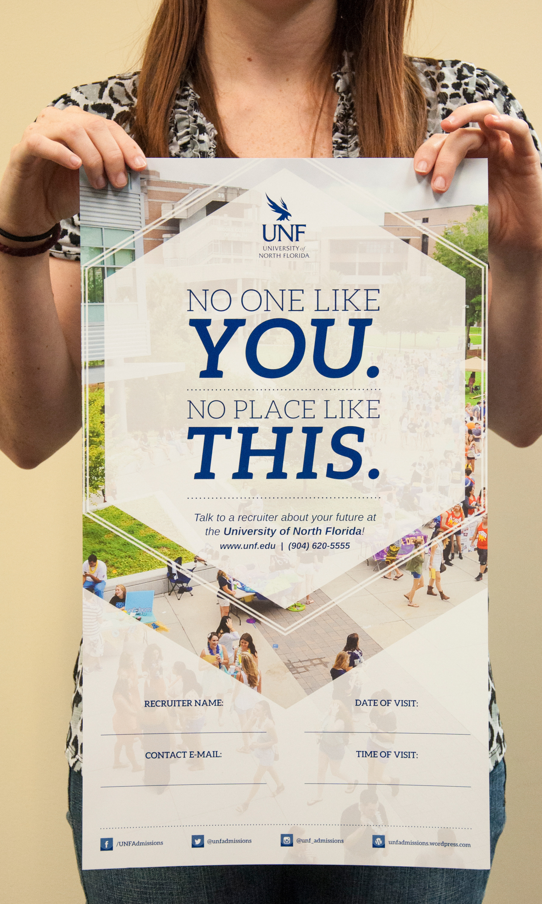
School counselor posters
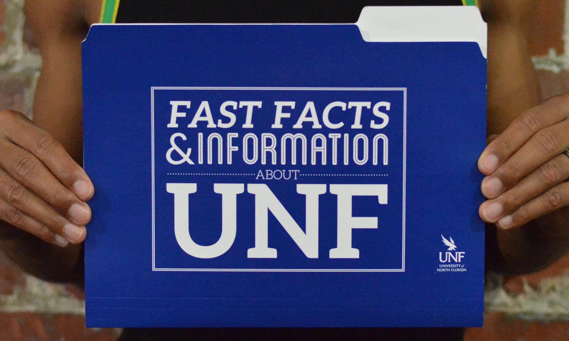
Outside view of the school counselor folder
Inside view of the school counselor folder
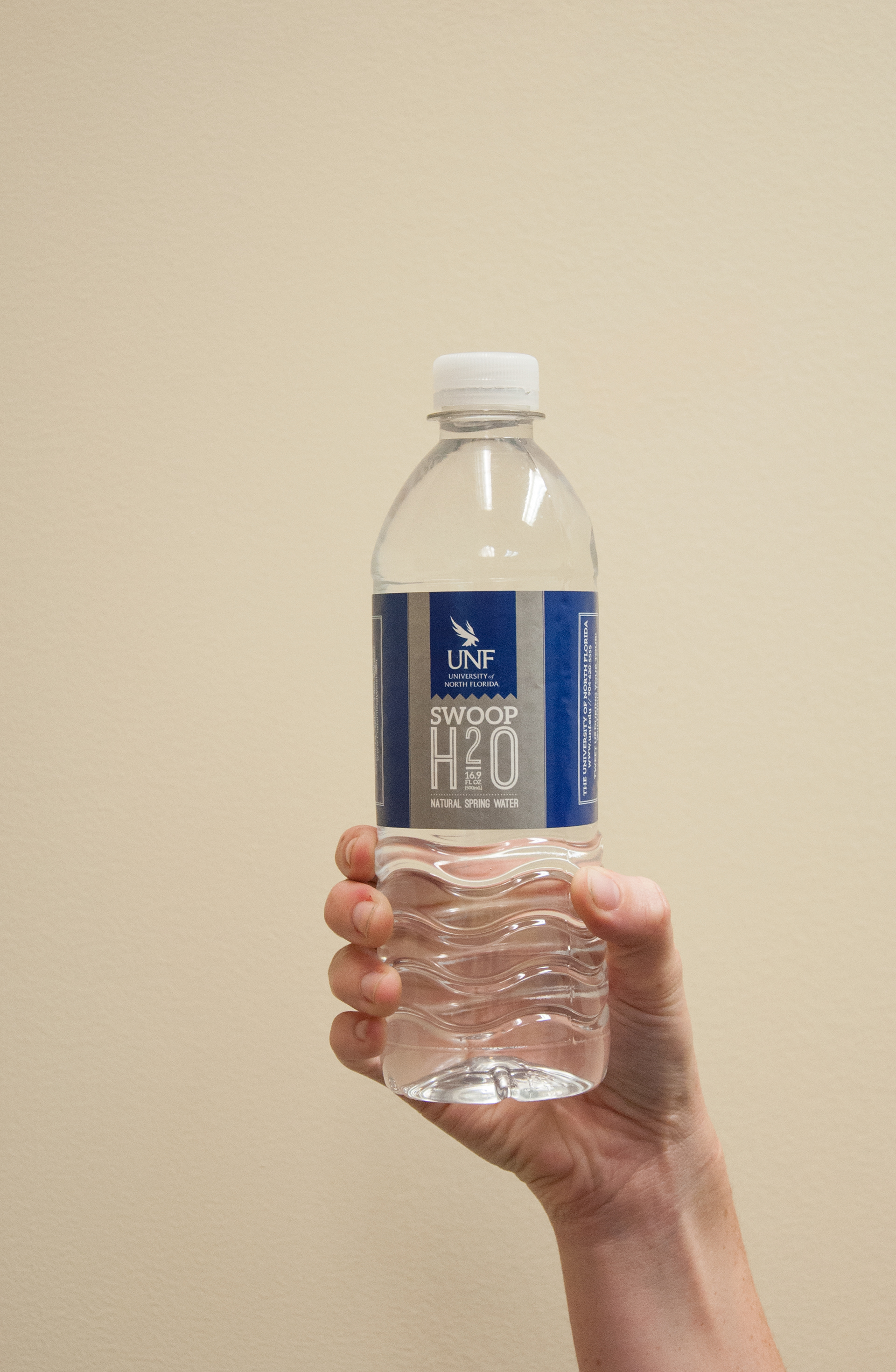
Front view of the Admissions tour water
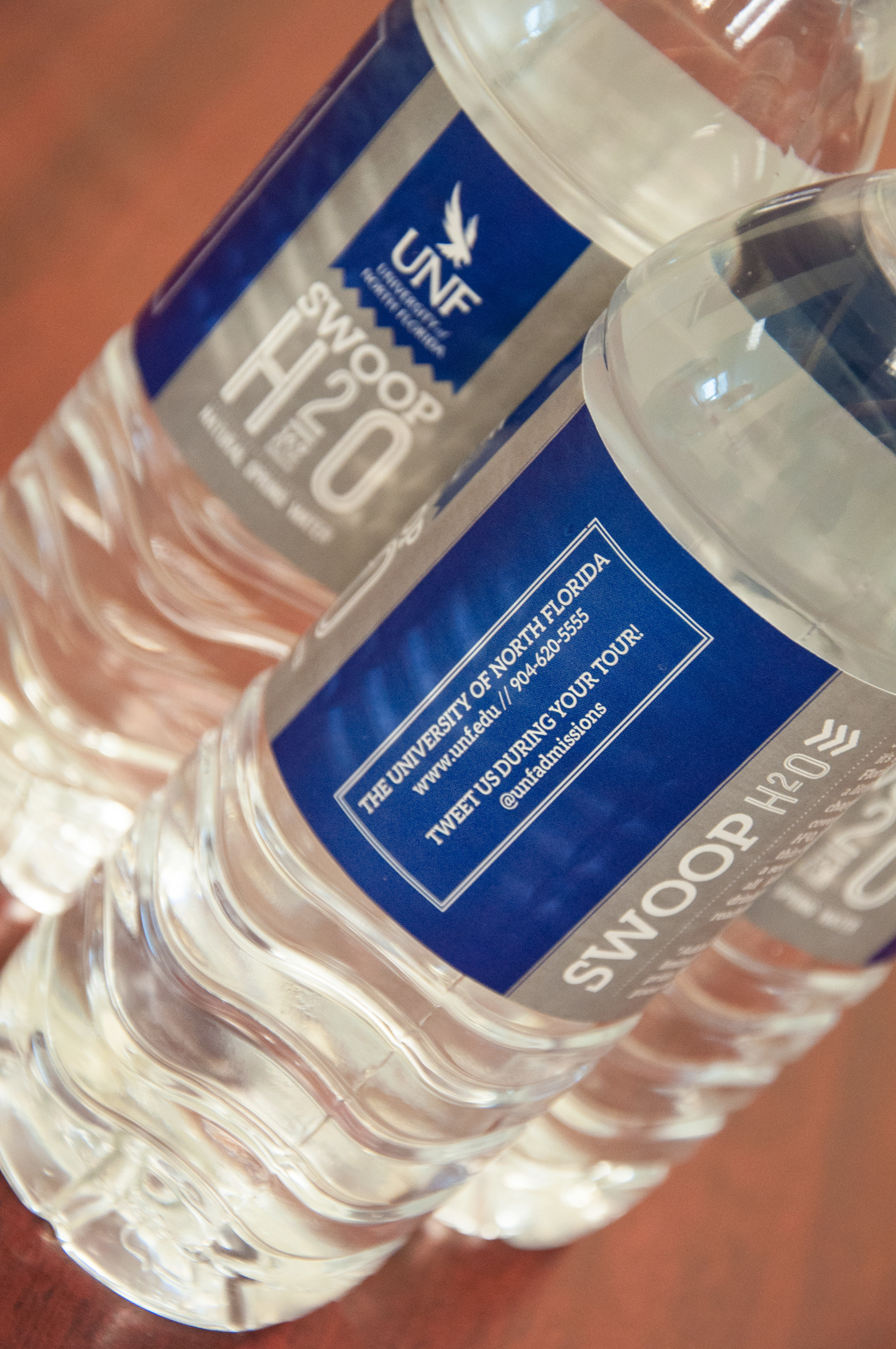
Side view of the Admissions tour water
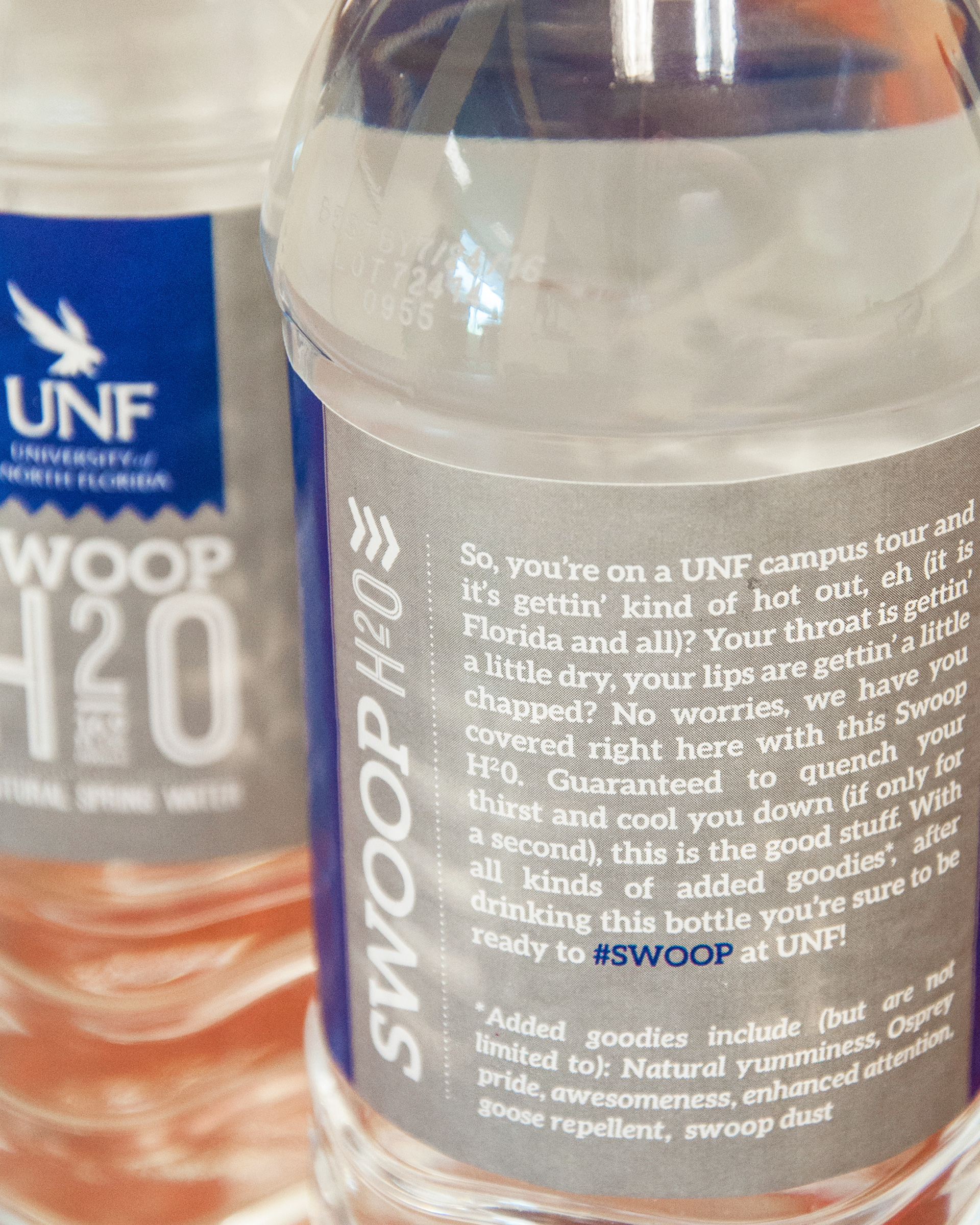
Back view of the Admissions tour water
This campaign was intended to increase recruitment by highlighting reasons to attend UNF. Each week, the reason would be posted on our various channels, and then would be supported by an email urging students to apply. As a result, we saw an increase in applications by 900.

Campaign example

Campaign example

Campaign example

Campaign example

Campaign example

Campaign example

Campaign example
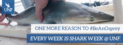
Campaign example

Campaign example
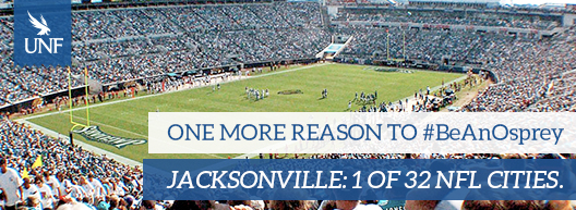
Campaign example
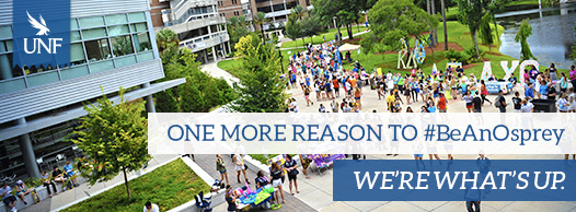
Campaign example

