

Florida Poly Full logo

Florida Poly Full logo - reversed

Florida Poly Alt logo - full color and reversed

Florida Poly Mark logo - full color and reversed
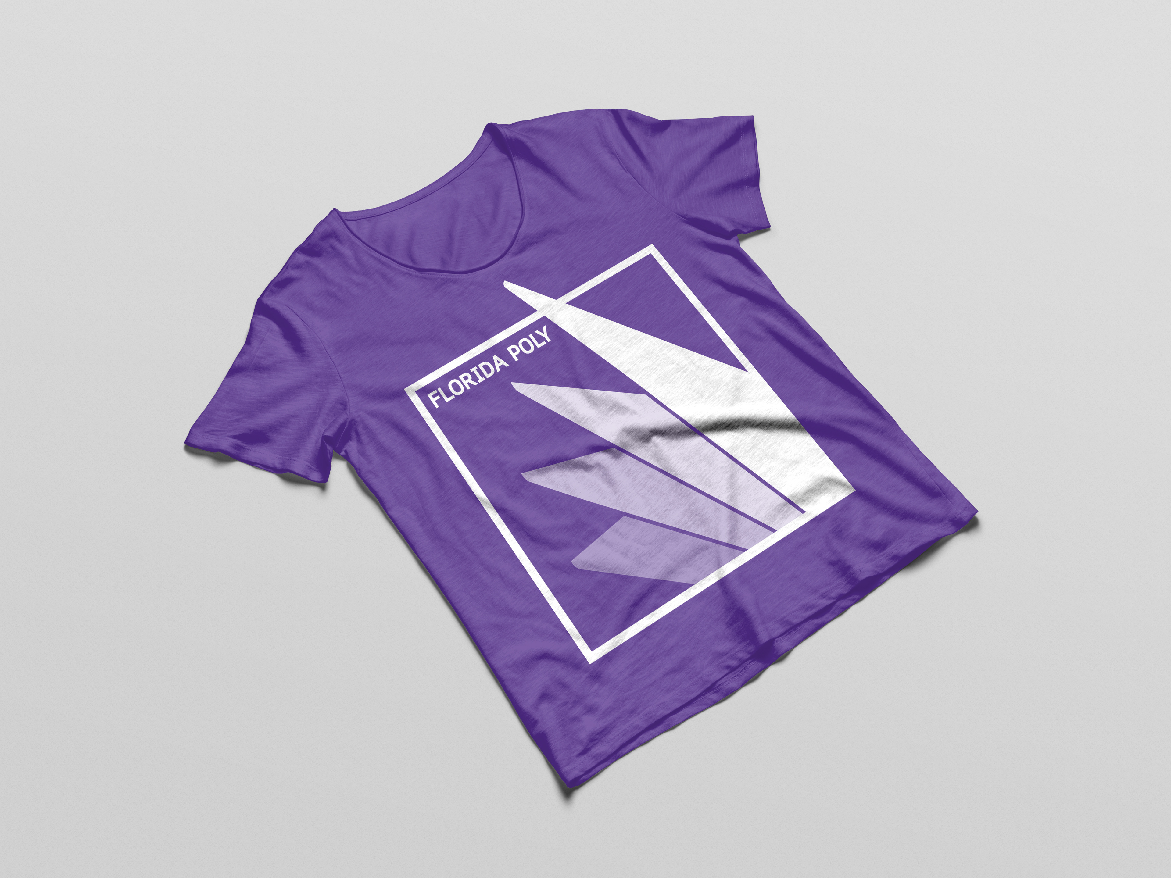
Florida Poly Alt logo t-shirt application
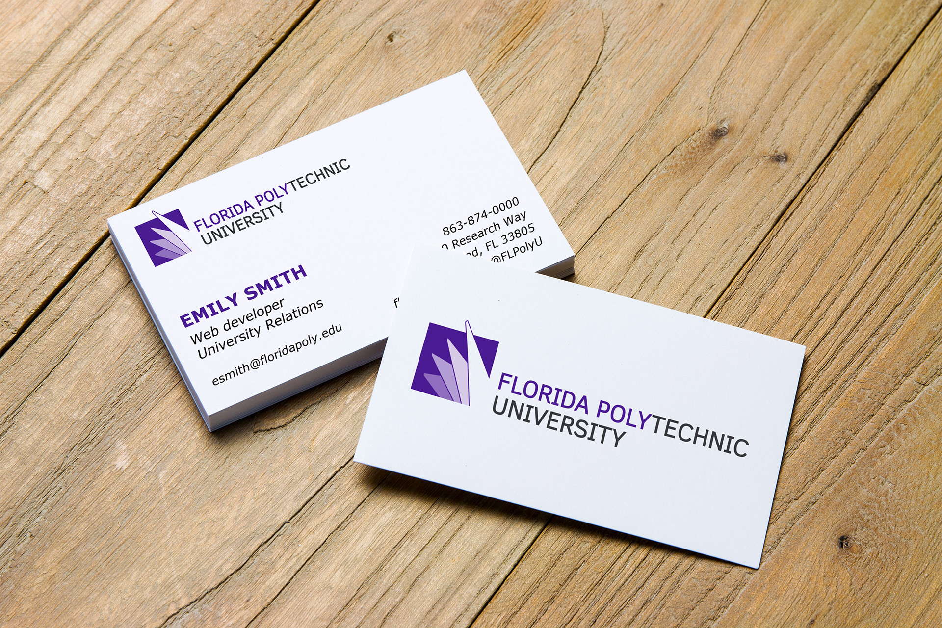
Florida Poly Business Card mock up